News
Marketer Magazine: On The Record: Conducting Strong Interviews with the Media
Gotta Be It to Make it: How Companies Profit from Green in Their Branding.
What happens to you when you see green? The short answer is—a lot. Mentally and emotionally, we associate it with nature and all things natural. Health and wealth. Freshness and energy. Prestige and growth. Creativity and productivity. And, let’s not forget, luck.
Studies have shown that our physical reaction to green is even more intriguing. Our muscles relax. Our allergy symptoms are reduced. Our ability to read improves. Even our pituitary gland is stimulated (don’t ask).
OK, it’s also associated with feeling poorly, jealous and greedy.
But its positive effects make it an ideal shade to strengthen brand images—and sell a lot of product.
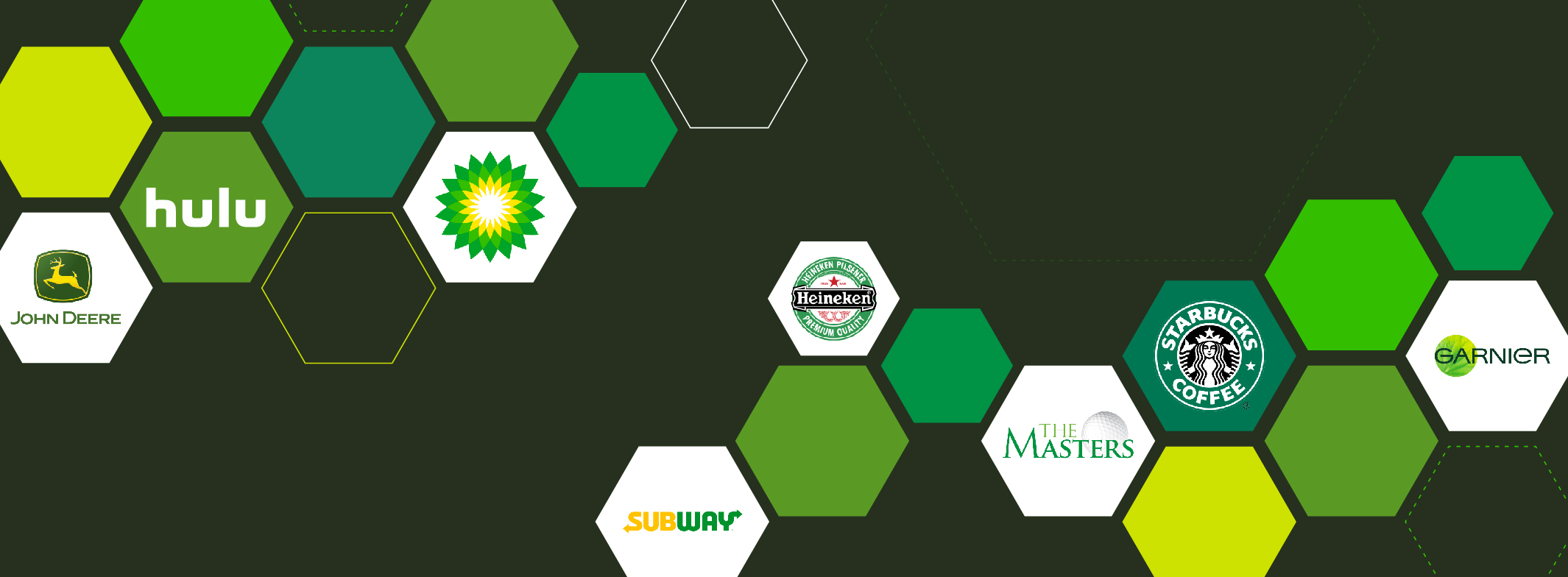
A few examples include:
- H&R Block (money, finance and to a certain extent, depending on your CPA, creativity)
- BP (energy, productivity)
- Heineken (fresh, natural, youthful)
- Starbucks (from the ground comes grounds)
- The Masters (from the fairways to the putting greens, a natural and prestigious choice)
- Rolling Rock (brewed from the natural springs of the Pennsylvania mountains)
- John Deere (enduring, productive, energetic)
- Hulu (youthful, fresh, creative)
- Subway (fresh ingredients, and lots of veggies for healthier choices)
What happens when you see green? A lot. See why many brands believe it's an ideal shade to sell a lot of product: https://t.co/8iyk6Mk2fD pic.twitter.com/hrhCSVqdY1
— Covalent Logic (@CovalentLogic) July 11, 2018
The colorful history of Fructis: Because it suggests vitality, freshness and even curative powers, people naturally equate green with the goodness of nature. But in 1904, this tidbit wasn’t particularly top of mind for Alfred Garnier when began selling his hair tonic around his hometown of Blois, France.
However, in the 1970s, when the Laboratoires Garnier company (now owned by L’Oreal) wanted to branch out globally with its extensive line of Fructis body and hair care products, it was wisely decided that nearly every bottle was packaged in bright green—thus evoking images of nature, citrus, organic freshness, vitality and healing. As their product rollout occurred simultaneously with the Green Movement, their packaging also became instantly synonymous with being environmentally conscious and earth-friendly. More than forty years later, their message via their color still connects with consumers worldwide.
