News
Marketer Magazine: On The Record: Conducting Strong Interviews with the Media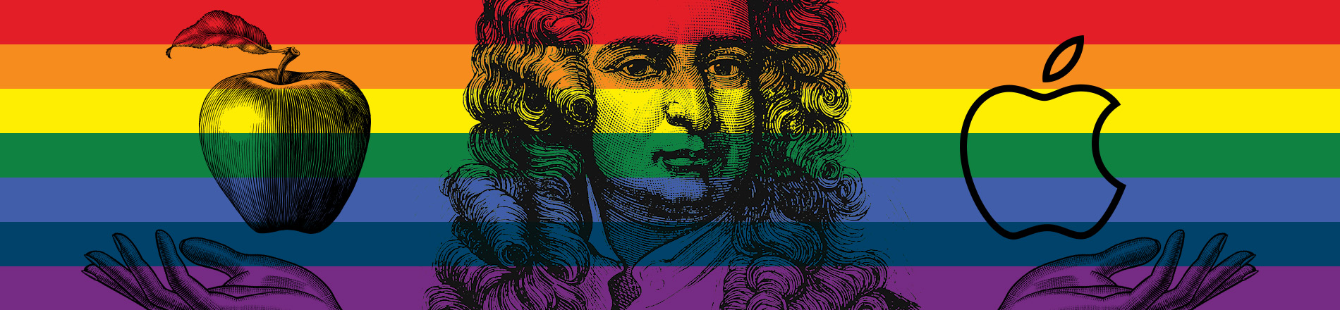
Paint Know Big Thing: Incorporating indigo into the branding of business
We’ve certainly discussed—at length—the psychology of color, and the reasoning behind the considerate choosing of a particular color to promote a business.
That being said, our first order of business is…the rainbow.
Sure, it’s our favorite meteorological phenom. But a little background goes a long way in illustrating how it’s been utilized in our culture, commerce and even political confederation.
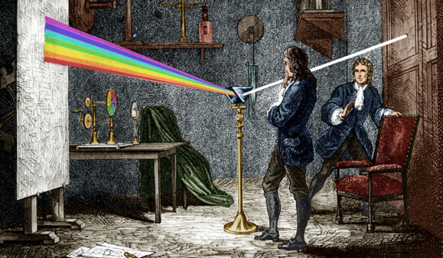
Somewhere in the 1670s, once apples stopped falling on his head, optic-nut Sir Isaac Newton discovered that sunlight on a prism (or in his case, rain drops) caused its colors to reflect, refract and ultimately disperse. Being the smart dude he was (and giving a nod to the Greek philosophy that seven is a really lucky number) he assigned each dispersed color a name, which today, we attempt to remember as Roy G. Biv (or Red, Orange, Yellow, Green, Blue, Indigo and Violet).
Over the years, the rainbow had had so-so success as a symbol for certain countries or causes. However, it wasn’t until 1978 that it truly began to shine. In response to a need for a rallying emblem that evoked harmony and understanding, San Francisco artist Gilbert Baker created the LGBTQ flag. Since then, it has become a globally-accepted and recognized image, blending the many colors of sexuality with the diversity of community.
One small wrinkle in this flag tale: because so many are frustrated by the inability to precisely identify indigo, it has been dropped from many modern-day Pride flags. Adding insult to indigo’s injury, there’s a growing movement petitioning to remove it completely from mother nature’s list as well (which would make Roy’s name even tougher to pronounce, much less remember).
As a show of “commercialized support,” companies from AT&T to NBC to Coca-Cola to American Airlines have at one time or another temporarily reinvented their logo by incorporating the rainbow, and thus allowing indigo to share co-star status.
But in terms of banner brand building, none have been more fruitful than Apple. Oddly enough, Apple’s original logo (which came out two years before Baker’s flag), featured a black and white sketch of Isaac Newton sitting under an apple tree. Deemed “too intellectual” by Steve Jobs, the task for a new, more relevant logo was given to designer Ron Janoff with simple instructions —“don’t make it cute.”
From Janoff’s many concepts, Jobs selected the apple-rainbow, mainly because it touted the fact that the Apple II could display color images, a rarity at the time.
A lesser known part of the story is why there’s a bite taken out of their logo. Many believed it was symbolic of Apple’s bold stance, as in “taking a bite of the technological apple.” The actual reason, according to Janoff, was so it wouldn’t be confused with a cherry. Sometimes simple is best.
![]()
With indigo’s association with positives such as integrity, responsibility and sincerity, its use in packaging and branding is widespread and well-established. Unfortunately, due to the “blurple” syndrome (see Yellow, My Name is Indigo Montoya), few can point to a logo and state emphatically, “that is indigo.”
While there are any number of companies incorporating indigo into their name (including ranches, book publishers, design firms and film production groups), no one has rung the bell more beautifully than IndiGo Airlines.
![]()
Founded in 2006, this low-cost, low-frills airline out of Gurgaon, India brilliantly combined its country (India), one of its chief exports (the indigo plant) and its primary function (GO!) to create a corporate name and identity few could ever hope to match. With its indigo-colored logo and flight attendant uniforms, it has grown in a short twelve year to become the most profitable airline in India.